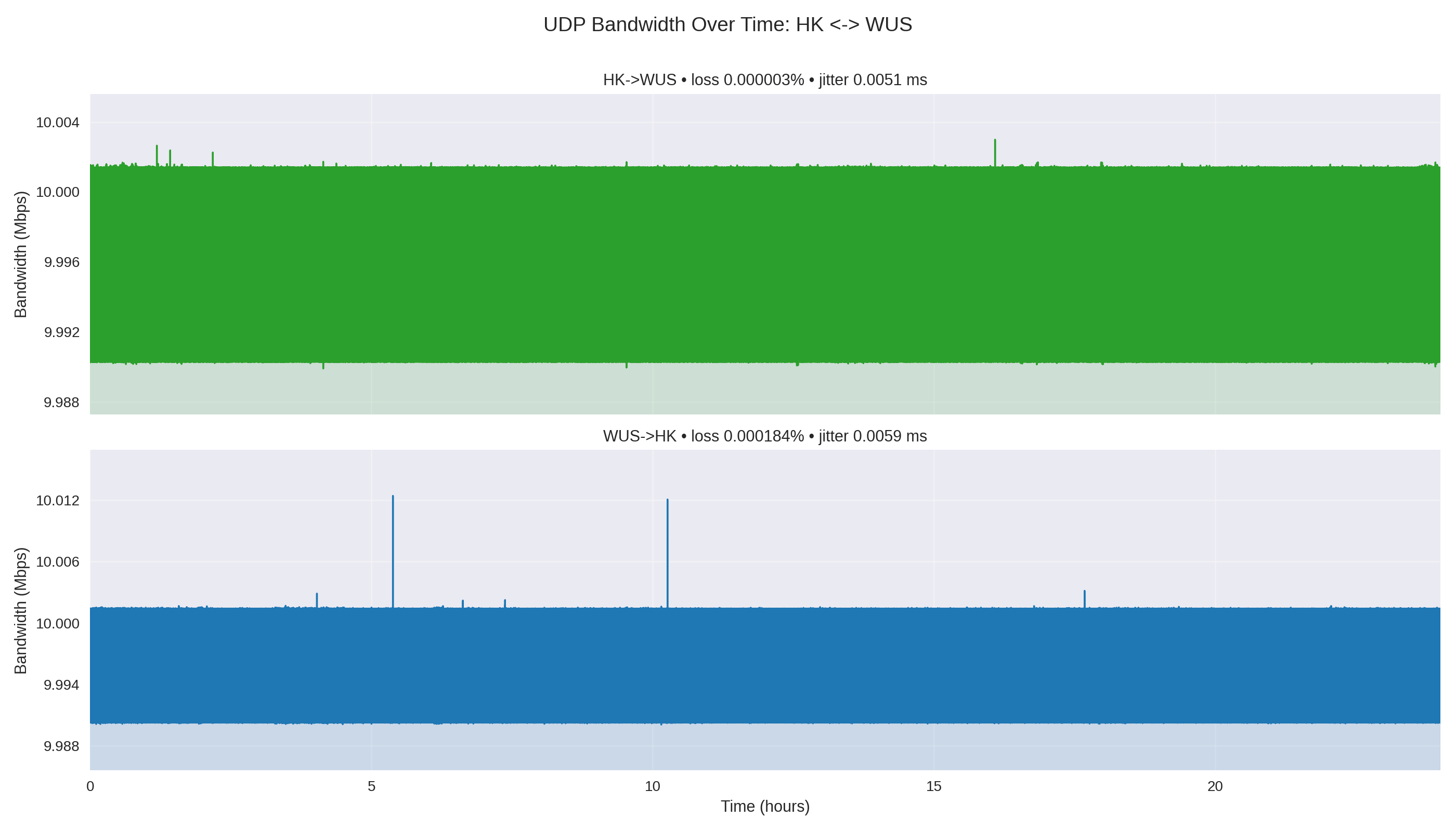
HK ↔ WUS
Clean and symmetric enough for a baseline path.
- 2 packets lost inbound
- 143 packets lost outbound
Presentation deck
A repeatable 24-hour UDP test for long-haul bandwidth stability, jitter, and packet loss.
Yingting Huang · Nov 2025
A tiny, steady UDP stream can reveal packet-loss and jitter patterns that quick spot checks never expose.
Each direction ran for 86,400 seconds at 10 Mbps.
Traffic stayed on Microsoft's backbone through global VNet peering.
The output is comparable data, not anecdotal network feel.
flowchart LR
  WUS[(West US hub<br/>VM + VNet)]
  HK[East Asia / HK<br/>spoke VM]
  KC[Korea Central<br/>spoke VM]
  UAE[UAE North<br/>spoke VM]
  HK <-->|global VNet peering<br/>UDP 5201| WUS
  KC <-->|global VNet peering<br/>UDP 5201| WUS
  UAE <-->|global VNet peering<br/>UDP 5201| WUS
Each run is named by direction, bandwidth, duration, and timestamp so the pipeline can parse intent without extra metadata.
#!/bin/bash
SERVER="${1:-172.16.0.4}"
OUTPUT_DIR="./test_results"
TIMESTAMP=$(date +"%Y%m%d_%H%M%S")
mkdir -p "$OUTPUT_DIR"
iperf3 -c "$SERVER" -u -b 10M -i 1 -t 86400 -J \
> "$OUTPUT_DIR/10M_24H_${TIMESTAMP}.json"flowchart LR Json[24H/*.json] --> Parse[parse intervals<br/>+ end summary] Parse --> Stats[compute stats:<br/>mean · std · loss · jitter] Stats --> Pair[group by<br/>region pair] Pair --> Plots[pair + direction<br/>PNG charts] Stats --> Report[summary_report.md]
Once the raw captures are in 24H/, one command regenerates the full comparison set.
| Direction | Mean Mbps | Loss % | Lost pkts | Jitter ms |
|---|---|---|---|---|
| HK→WUS | 10.0000 | 0.000003 | 2 | 0.0051 |
| WUS→HK | 10.0000 | 0.000184 | 143 | 0.0059 |
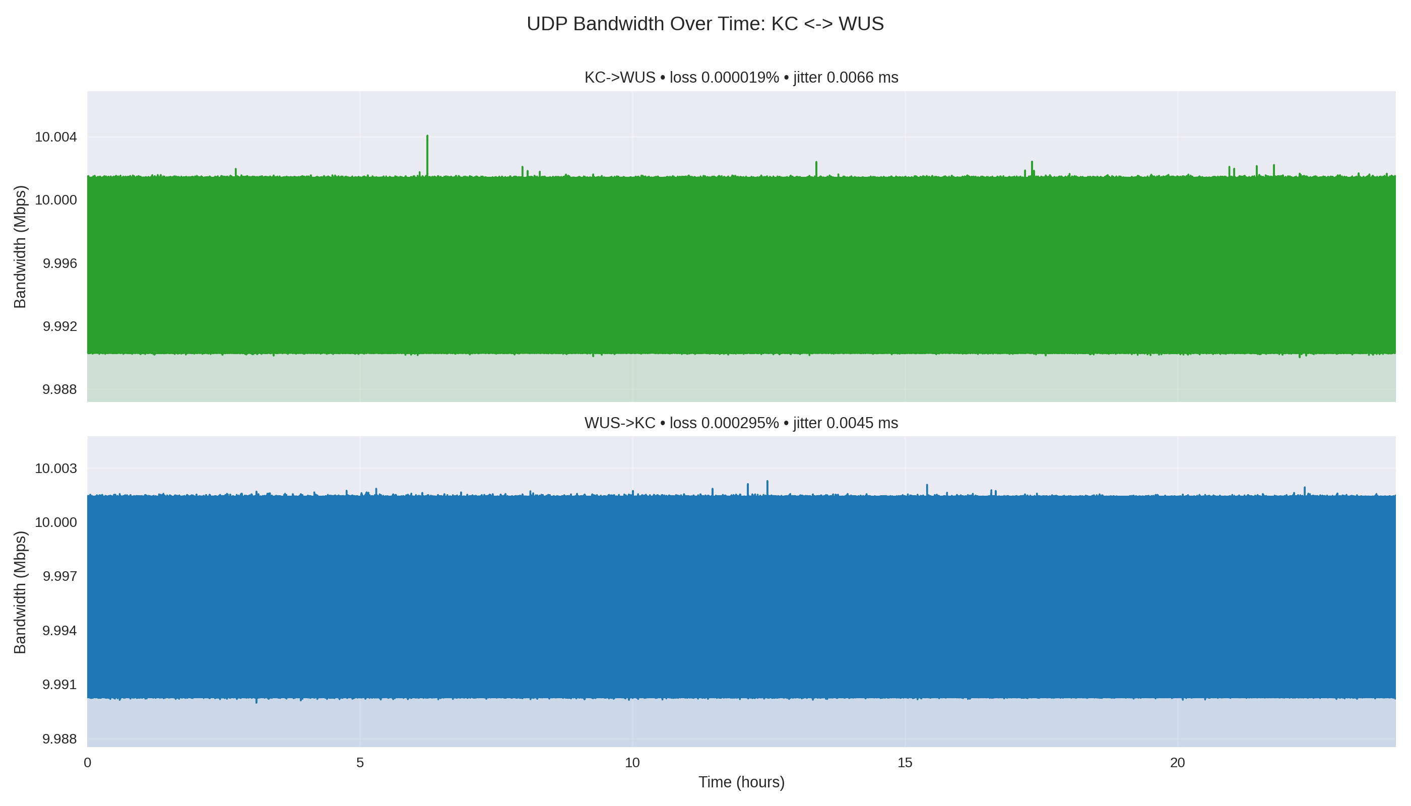
| KC→WUS | 10.0000 | 0.000019 | 15 | 0.0066 |
| WUS→KC | 10.0000 | 0.000295 | 230 | 0.0045 |
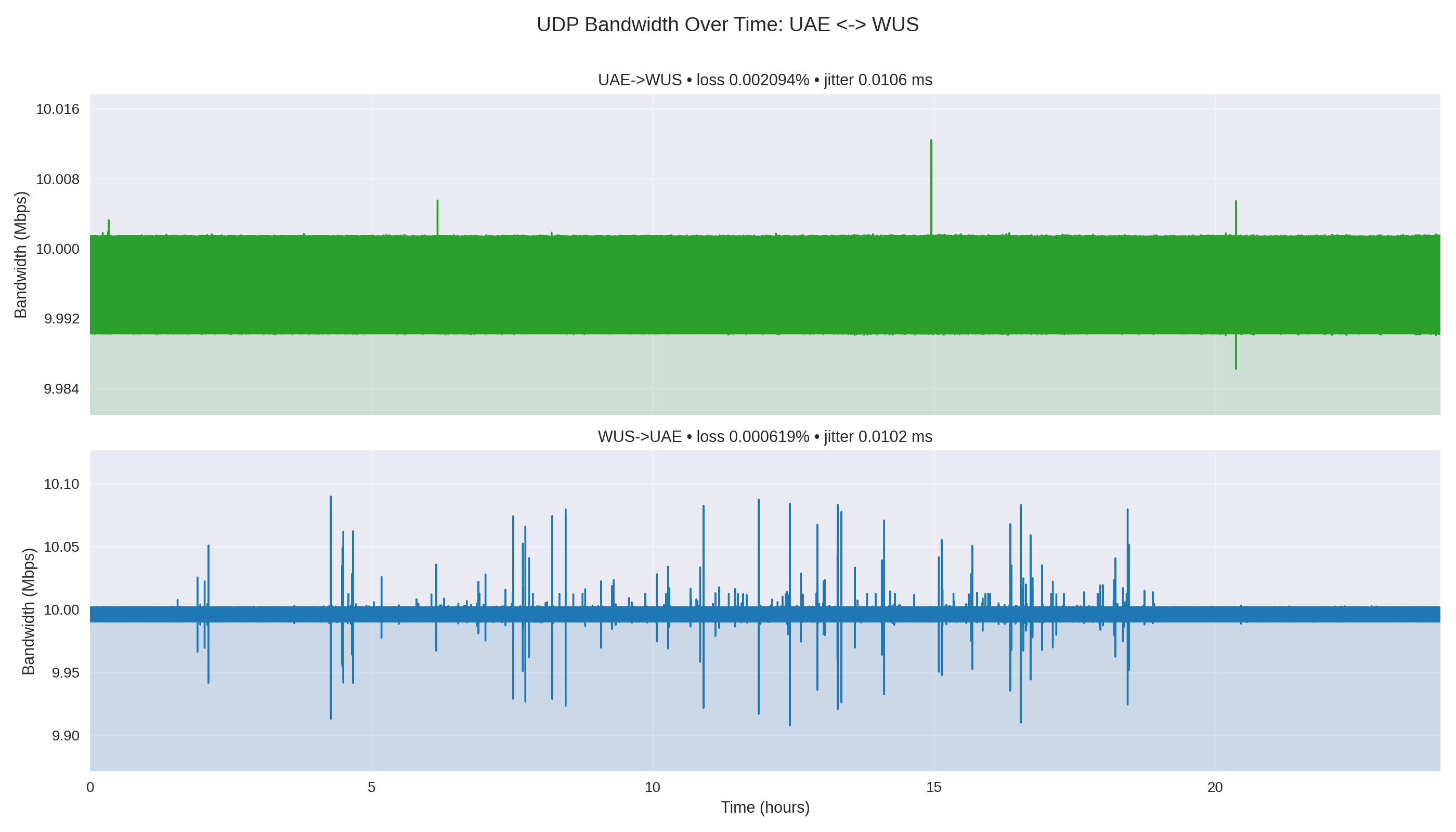
| UAE→WUS | 10.0000 | 0.002094 | 1,632 | 0.0106 |
| WUS→UAE | 10.0000 | 0.000619 | 482 | 0.0102 |
10 Mbps UDP over 24 hours; totals are from the article's iperf3 summary table.
Throughput stayed flat; the useful difference was that UAE loss was tiny in absolute terms but much higher than HK and KC.
UAE→WUS lost 1,632 packets; WUS→UAE lost 482.
HK and KC stayed close to zero-loss behavior.
Jitter on UAE legs was roughly double the HK/KC range.
Clean and symmetric enough for a baseline path.
Also clean, with very low loss in both directions.
Still stable, but the first path to investigate.
Pair charts stack both directions so tiny blips are not hidden by overlapping traces.
Provision endpoints, run both directions, collect JSON, then regenerate diagrams and the report.
The real value is a repeatable baseline: rerun the same path after routing, region, or workload changes and compare the drift.
The artifacts are deterministic: JSON in, charts and Markdown out.
Direction labels make asymmetry visible without manual cleanup.
A future GitHub Action could publish the same report automatically.